
Lorem Ipsum
Lorem ipsum dolor sit amet consectetur adipiscing elit.
The blog of Ada Rose Cannon
I work on Safari at Apple and participate in web standards for spatial and immersive technologies at the W3C. I build demos, give talks, and write about the web platform.
A collection of web projects and prototypes.
Talks I've given on WebXR, web standards, and the web platform.
More about who I am and what I have worked on.
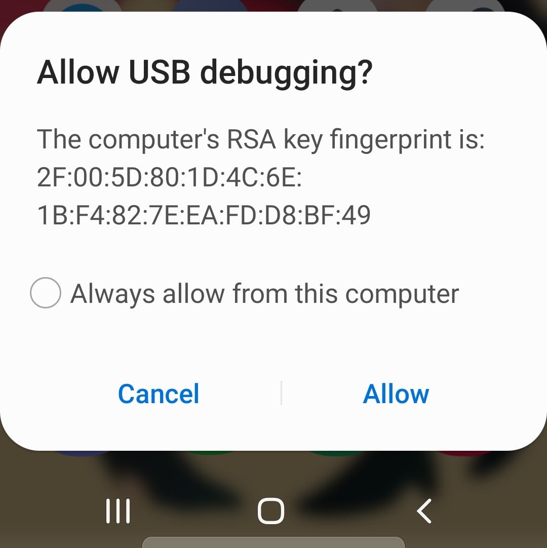
As desktop browser developer tools improve continuously, the responsive design modes are incredibly useful for testing out designs on other screen sizes such as tablets and mobile phones. For web developers, it can be tempting to rely on these tools for full end to end development, but I want to highlight the important of testing on real devices.
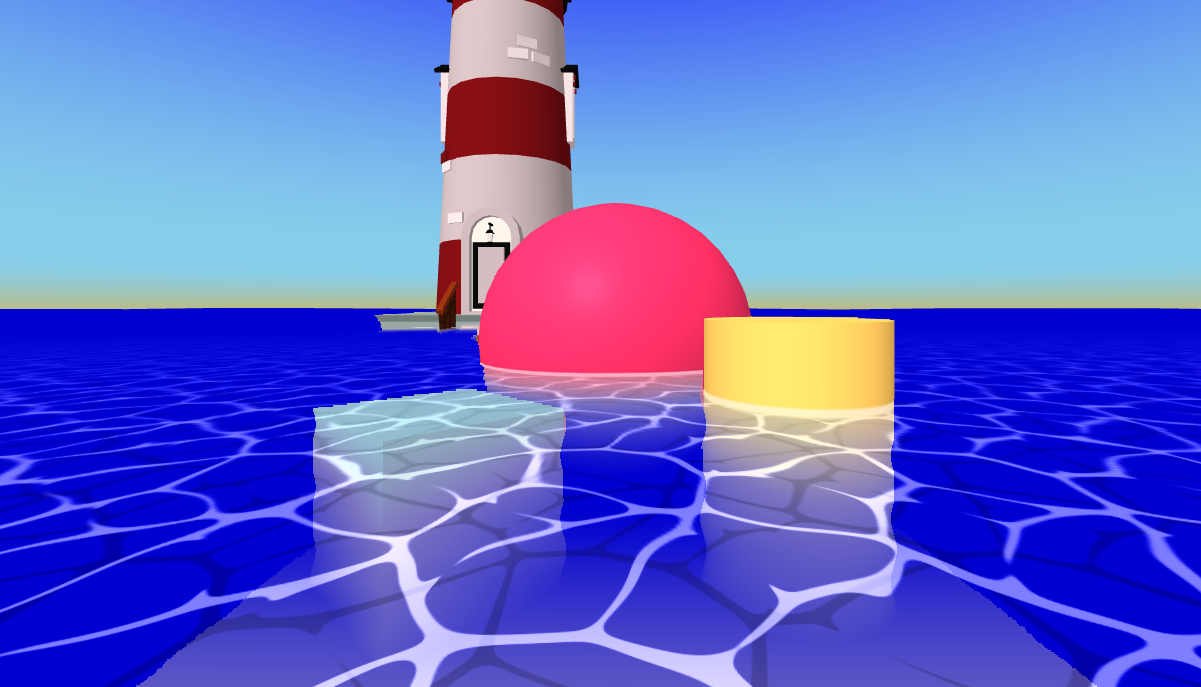
This is a 3 part breakdown of how this water effect works, you can view the finished demo here: https://a-toon-ocean.adarose.dev/
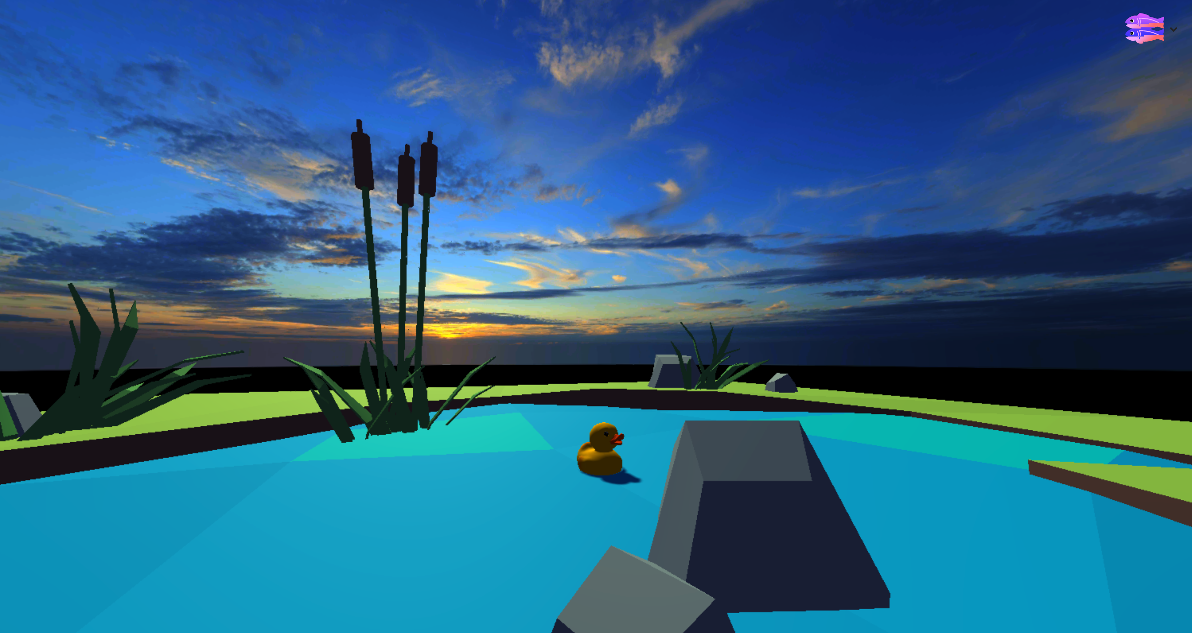
You can have 6-8x more images in your WebGL scene by using Basis Universal textures which are very efficiently compressed. This article describes how to encode images as Basis files and read them with THREE.js
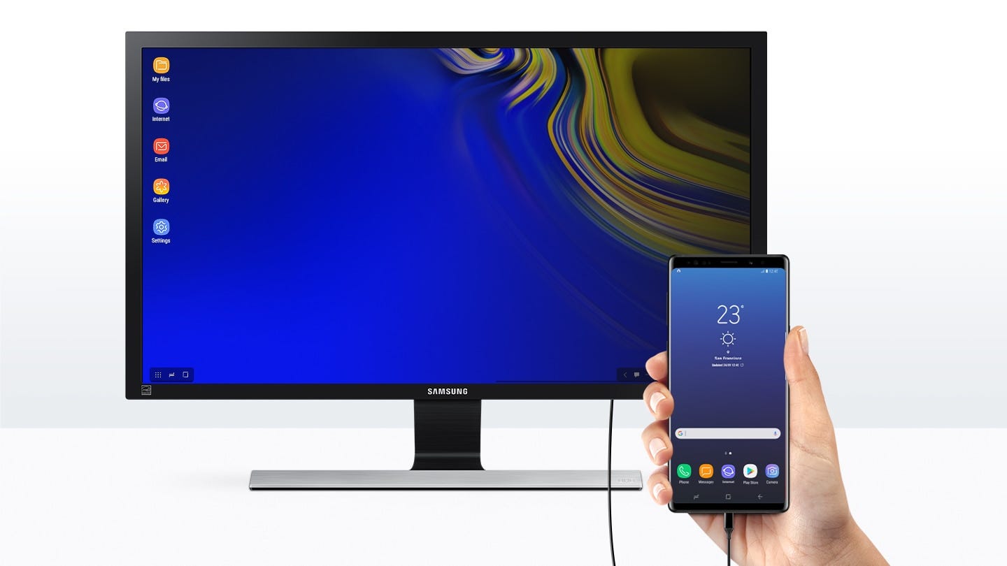
A mistake consistently made by some of the biggest websites shows they are thinking about responsive web design incorrectly.
The demo in this article show’s how to uses the Houdini paint API, which is a part of the larger Houdini spec. Houdini is still coming to browsers but is ready to try out.