Six assumptions which could break your website
A mistake consistently made by some of the biggest websites shows they are thinking about responsive web design incorrectly.
On this Samsung Internet blog we often talk about building progressive web apps, one cornerstone of building web apps is responsive design. Responsive websites can behave correctly regardless of screen size. It is the recommended behavior for website’s from the UK governments digital service team:
Here at Samsung as we innovate on hardware we often introduce new devices. These new devices frequently break some websites in interesting ways but one of the most common and avoidable ways websites break is the website not fitting the device correctly.
This often occurs when website developers make too many assumptions about the devices which people will use to view the website.
“I support both form factors: My iPhoneX and Chrome on a 15” Macbook pro.”
This article won’t be a technical deep dive into Responsive Web Design but instead we will discuss some false assumptions developers often make which will make websites brittle:
“It’s okay to build separate sites for mobile and desktop”
URLs should relate to content not form factor. To assign a different URL to content for different devices violates the One Web Principle. A URL shared from one device should work great on another.
“Mobile and Desktop are the Only Two Form Factors.”
Web Browsers are implemented on a wide variety of devices. There are a wide variety of hand held devices beyond mobile phones such as feature phones, e-readers, tablets and phablets. Which come in a huge variety of screen sizes and aspect ratios.
On top of that there are devices meant to be viewed at other distances such as browsers built into TVs or Refrigerators.
Desktop users have the most variation from users on giant 4K screens to users on tiny pocket laptops. In addition desktop users are likely to change size on the fly or prefer to use a smaller or vertical window.
“Mobile devices have fixed sizes or aspect ratios.”
Frequently website designers will set breakpoints to accommodate the size and aspect ratios of the popular Apple iPhones. Unfortunately this doesn’t reflect the reality of device sizes.
What makes it really tricky is that phone sizes evolve. A web page based around a singular generation of devices is not going to be future proof. You could make rules for every known device available and tomorrow a device could be made which you didn’t expect could break everything.
I have seen situations where each device which breaks the layout becomes a new edge case handled in the CSS until there are so many edge cases the CSS becomes difficult to make changes to. By making the CSS truely responsive from the start the CSS should be a lot more manageable.
“Window size on mobile devices doesn’t change.”
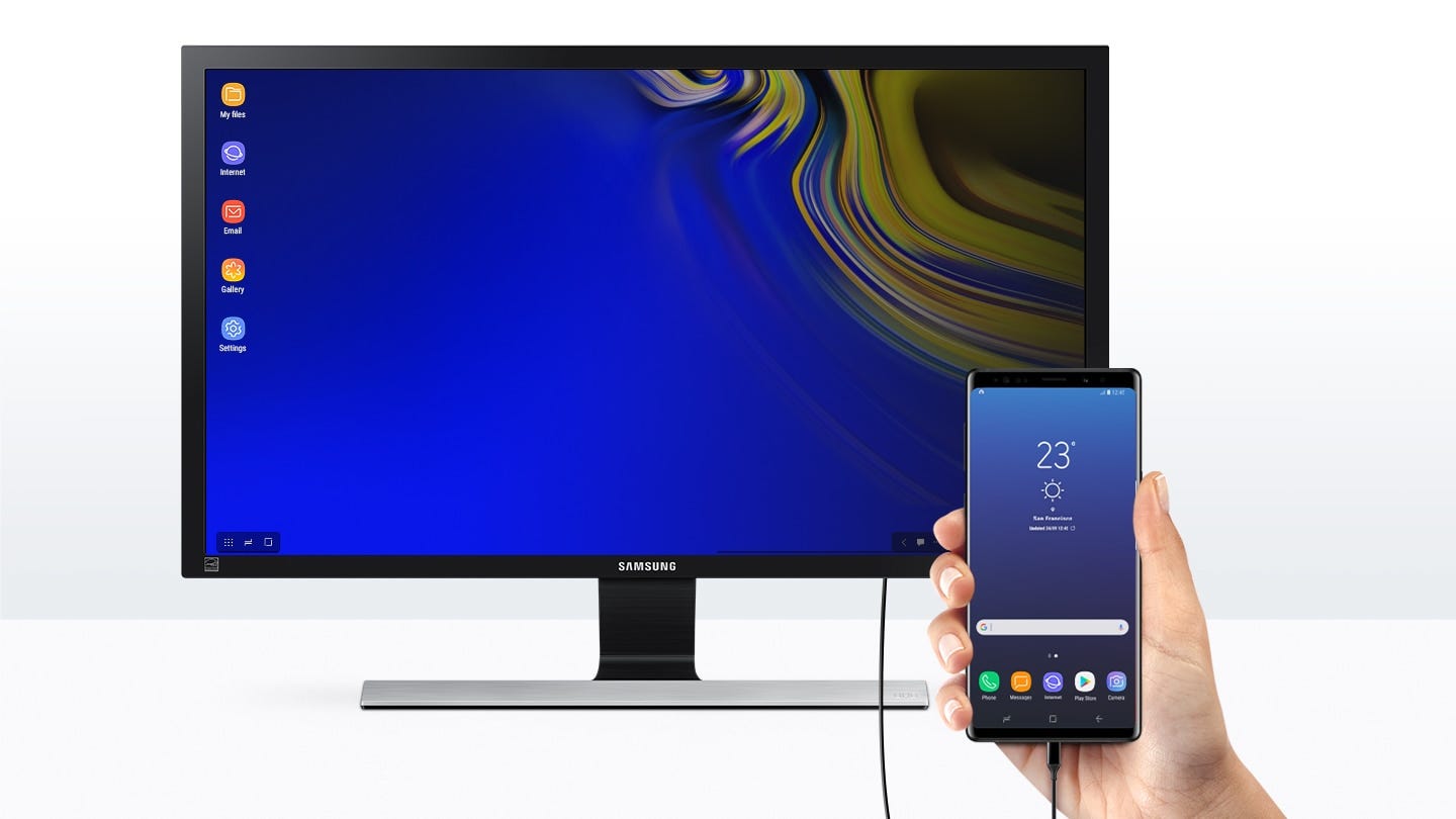 Samsung DeX
It’s not just desktop users which change the window size though. A couple of years ago we released Samsung DeX to let phones be used as desktop computers. When the phone is attached to a computer monitor it behaves as a Desktop computer, our web browser Samsung Internet would seamlessly continue where the user left off on the phone.
This capability was only possible because of responsive design. Unfortunately some sites which had mobile only pages on a separate URL gave a poor user experience when they were resized to become a full desktop web site.
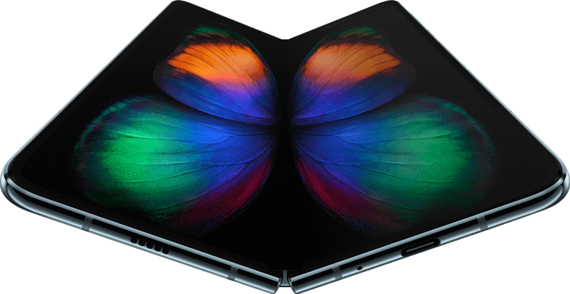 Samsung Galaxy Fold
We still see these issues today, recently with the release of the Galaxy Fold series, the folding phones.
These phones have two screens a thin outside one and an almost square folded screen.
When testing with this device we discovered many websites can’t handle changing shape from the small screen to the large or break on the thinner than usual outside screen or the wide unfolded screen.
On large screen devices such as the Note 9, or S10+ the user of the device may choose to split the screen vertically or run the browser in a floating window.
“Real work gets done on desktop computers or in apps.”
One issue I see is that frequently websites which otherwise do responsive design very well hide essential functionality such as the ability login on mobile with the assumption that real work will be done on the desktop site. This forces users who don’t have a desktop available to use the browsers force desktop mode which will probably be an awkward experience compared to one optimised for mobile.
“I can infer whether the user is using touch interface or mouse from the screen size.”
You cannot.
Some laptop screens are smaller than my phone screen. Some phone users use a mouse and keyboard. Laptop users may swap from mouse and keyboard to using it like a laptop by rotating the screen. Desktop users may have an external touch input screen they are doing their browsing on.
To handle this, treat all users like they are using touch devices; make touchable areas large and clear with plenty of space.
Sigh… so you’ve read this whole article and still want to specifically target the Samsung Galaxy Fold Folding Phone?
Use this information for testing your site only, don’t build these dimensions into your CSS file as break points! Make sure it works at these sizes but don’t handle them as an edge case.
Here are the CSS pixel dimensions of the browser in each different mode:
-
Closed: 320x747px
-
Open: 586×820px
But please bear in mind that future devices may change the screen size or the phone user may choose to move the browser into a window which only takes up part of the screen.
What to focus on when building a responsive website
(By responsive website, I just mean website, all websites should be doing this.)
Responsive design should allow you to resize the browser window to any size or aspect ratio and still maintain a good browsing experience.
Don’t use the hardware to determine the layout. You can’t control that. Instead base the layout of your pages on your content so that your content makes sense no matter what device it is in.
The points at which we change the layout at different sizes are known as ‘breakpoints’, a common mistake is to use a breakpoint for each device you want to support. This is a mistake because each breakpoint you add counter-intuitively makes your design less flexible and more likely to break on devices you haven’t anticipated.
Ideally we wouldn’t use any breakpoints and have a single layout which can handle all screen sizes well but often this is impractical. We use CSS media queries to define how the page behaves at various sizes. Having one or two breakpoints will allow changing the layout radically at different screen sizes without introducing too much inflexibility.
A neat way to have certain properties be screen size dependent without introducing more breakpoints is to use the viewport units vh and vw which are ¹/₁₀₀ of the height and width respectively. When combined with calc() in CSS they can be very powerful.
Recent CSS APIs mean that building responsive designs is no longer an arduous task. The CSS grid API lets you design multiple layouts which make sense and the content will then fit that grid. To learn more about CSS grid check out these demos by @thisisjofrank, which explain how common layouts can be created with CSS Grid:
CSS Grid has near universal support in browsers, for the users still stuck in old version of IE use a simple flexbox layout fall back. Websites don’t look the same to every user, that is one of the powers of the web. Find more info on CSS Grid and Flexbox on MDN.
You can use the @supports CSS rule to provide the correct styles to each browser.
Note regarding pinch zoom, some app developers choose to disable pinch zoom on their site to speed up touch-clicks or to control the user experience. In modern browsers you can have both fast touch-clicks and pinch-to-zoom. Disabling it just means that users with accessibility requirements will find it harder to use your website.
<!--
Meta tag which enables responsive design
has fast clicks and allows pinch to zoom.
-->
<meta name="viewport" content="width=device-width, initial-scale=1">
Thank you so much Amy Dickens and Daniel Appelquist for your feedback to this article.
(Bonus) Some of my favourite CSS Grid tricks
Layout becomes a lot easier when built with CSS Grid, it’s essentially a very powerful layout framework built into the browser.
You don’t need a framework to use CSS Grid. CSS Grid is a framework. — Rachel Andrew (@rachelandrew)
Custom CSS Properties make doing Responsive design very clean. By only using custom properties in media queries you can make it very explicit what is changing as the screen size changes.
:root {
    --padding: 15px;
    --grid-columns: 5;
}

.my-grid {
    display: grid;
    grid-template-columns: repeat(var(--grid-columns), 1fr);
    grid-gap: var(--padding);
}

[@media](http://twitter.com/media) only screen and (max-width: 1000px) {
    :root {
        --padding: 10px;
        --grid-columns: 3;
    }
}

[@media](http://twitter.com/media) only screen and (max-width: 600px) {
    :root {
        --padding: 20px;
        --grid-columns: 1;
    }
}
Another nice use of custom properties is to store complex properties in a single easy to edit place.
// Each emoji represents a grid area, e.g. 🍱 is the header
:root {
  --layout-big: "🍱 🍱" min-content
        "🌯 🐠" min-content
        "🍭 🐠" 1fr
        "🏖️ 🏖️" min-content
        /300px 1fr;

  --layout-small: "🍱 🍱" min-content
        "🌯 🍭" min-content
        "🐠 🐠" minmax(min-content, 1fr)
        "🏖️ 🏖️" min-content
        /1fr 1fr;

  --active-layout: var(--layout-small);
}

header {
  grid-area: 🍱;
}

.my-grid {
  display: grid;
  grid-template: var(--active-layout);
  grid-gap: 1em;
}

[@media](http://twitter.com/media) only screen and (min-width: 600px) {
  .my-grid {
    --active-layout: var(--layout-big);
  }
}
This allows for complex statements such as these grid-template properties to be kept at the top of the document or even imported from a separate CSS file, they can be changed by updating the –active-layout custom property.
I hope you find that CSS Grid makes it less complicated to produce clear, robust, responsive layouts which will not break on future devices.
By Ada Rose Cannon on June 11, 2019.