Multiple Language Installable Web Apps using a single Manifest File
Many Websites provide multiple language variations allowing users to comfortably use the site without relying on machine translation. When you making this website into a Progressive Web App you have a choice to make:
Do you have a single PWA for all languages or do you make a PWA on a per language basis?
It’s easy to mistakenly apply the restrictions of Apps to PWAs, due to the additonal cost and work required in submitting your native app to app-stores many companies provide a single app which can be configured from the inside.
The Web is a lot simpler you can sub-divide your site into as many progressive Web Apps as you want. Each Web App manifest you make becomes a new Web App. So making a Web App for each language has the advantage of being localised into the user’s language when installed on their homescreen!
You can set the start_url to be the language specific version i.e. /en/ , /fr/ , /kr/ but have the app scope set above it to / so even when the user changes their language it is still associated with the installed progressive web app.
A shortcut using a single manifest file
The technique I am going to talk about in this article is an interesting hack for providing language specific versions of a manifest file using a single manifest file as a template to generate the localised versions.
It works by embedding the manifest file itself as a URL encoded <link> tag on each page. This lets you take advantage of your templating system to automatically populate the Web App Manifest so everytime you add a new translation you automatically get a new Web App!
This technique is especially useful on static site generators like Jekyll where each file gets transformed into a single other file preventing you from automatically generating multiple manifest files.
In short the technique is to populate the language specific Web App Manifest, url-encode it and have it linked in the head directly.
To make this work in Jekyll the `<main>
Future Focused Responsive Design
Embracing the spirit of responsive design and accessibility to support the next generation of devices
Embracing the spirit of accessibility & responsive design to support the next generation of devices
Year on year devices get more varied and integrate into our lives in different ways. There is a trick to supporting these new devices on the web (at the end of the article 😉.) But it’s important to learn from our past mistakes.
Before responsive design
In 2007–2010, during the start of the mobile phone boom, the web was facing a fork in the road. These devices were able to access the standard desktop-only web. This new mobile format of devices gave web developers a problem. How do you support both large screens with mice and keyboards, and small touchscreen devices?
In the early part of this era many developers opted to build two versions of their websites: a site for desktops and a redirection to a separate m-dot website when the User Agent string from a mobile phone was detected. Making a separate Web for mobile devices had been done before in the form of WAP websites. (WAP was a version of the Web for feature phones that went out use when phones could browse the regular web.)
Today the the m-dot site route is often thought of as a mistake, as it started to divide the web. One Web for desktop computers another for phones. One of the principals of the web is that URLs continue to work no matter what device is using them. M-dot sites break this principal because URLs stop working between devices. For example: a common issue is that if someone on mobile receives a URL such as example.com/somefile.html?q=somecomplexstring then they may get redirected tom.example.com. The URL has had all the context stripped away and the user has no guarantee they can find that content on their device.
You can still find the legacy of m-dot sites in the web today, they aren’t all broken like the early ones were. The best m-dot websites tend to be built on the same stack as their desktop counterpart and often only redirect for mobile devices. Whilst rarely delivering a broken experience, this method is not as good as responsive design. Interestingly, for many famous sites such as Twitter their mobile site became their progressive web app, and eventually their only site.
Responsive Design Today
Responsive design is building a single website which uses HTML and CSS to give an appropriate experience based upon the detected features of the display and the user’s preferences.
A naive approach to responsive design assumes that small screens are definitely mobile devices and anything else is definitely a desktop computer. A common pattern you see in older platforms has breakpoints fixed at the pixel screen sizes of the iPhone 3 and the early iPads, with different designs targeting these fixed sizes. Whilst an improvement, this is not much better than detecting based on user agent strings.
The issue with this is that it conflates supporting a wide range of mobile-specific features with a small screen size. In the end it is just swapping out one irrelevant metric for another. True responsive design needs to not fixate on specific pieces of hardware but try to build something that will work as widely as possible using a variety of different metrics.
What responsive design means for the next generation of devices
For a long time responsive design has mostly meant phones with touch screens in a narrow range of sizes, tablet devices which could often be treated as large phones and laptops/desktops, where even if they had touch capabilities touch could just be ignored.
The next generation of devices doesn’t conform to these rigid definitions. They are flexible — not just in capabilities, but also literally flexible. Commonly today you will see laptops which can fold away or detach their keyboards to act as tablets. If you don’t have a good touch interface with large distinct interactive regions then users will have a bad experience, and you have no way of telling whether the device is being used as a tablet or desktop.
Screen size or User Agent String mean less now for a device’s capabilities than ever before. Often a mid to high end phone might be considerably more powerful than the same user’s laptop computer.
Folding phones like the Samsung Fold have an extremely narrow screen on the outside, narrower than most devices you will find in the wild. However, on the inside have a large tablet size screen, running the same browser with the same user agent. And that is before you consider that it can be plugged into a display and used with a keyboard and mouse.

As folding display technology advances these discrepancies between experiences on a single device are only going to get larger.
As computing power continues to get smaller, cheaper and more energy efficient, you will start finding web browsers on a wider variety of hardware such as fridges, TVs and other smart home devices. In these cases the display may be large and at a distance, rather than small and close by.
Wearable technology is another space where browsers are increasingly found. Smart watches are getting more capabilities each year and with precious little screen real-estate can run a full web browser. Another kind of wearable display that may soon be a common sight are AR headsets with web browsers.
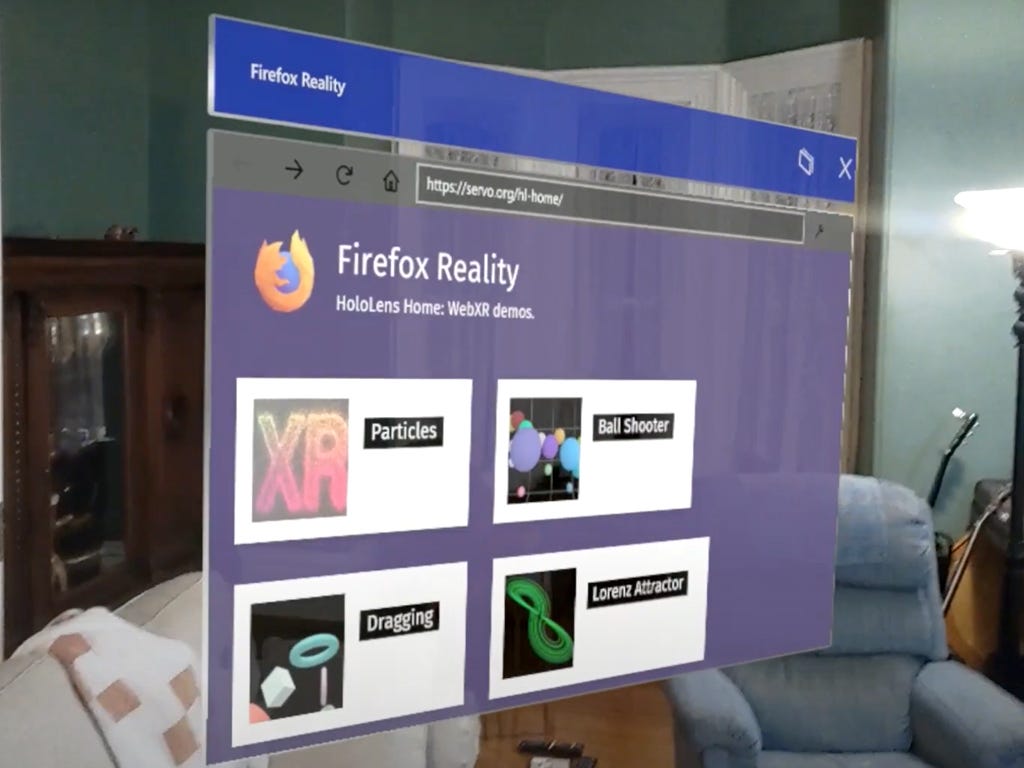
AR Web Browsers are similar to TV and Refrigerator browsers in that they are normally large (virtual) displays used at a distance. They are probably controlled by some kind of laser-pointer-like gesture controller, either through controller hardware or hand tracking.
Hand tracking in immersive headsets, whilst pretty good, can be tricky and awkward to use. It can feel like trying to poke a web page one handed using a pool cue. Using an accurately tracked controller is slightly easier but still feels like trying to use a long stick to interact with the page. So interactive elements (like buttons) need to be large with lots of padding.
Additionally, large amounts of text can be unpleasant to read in AR. So focusing more on clear graphic design and using images effectively will go a long way to making a page easier to use.
It is also important to keep in mind that many AR displays cannot go darker than the surrounding environment, so dark mode pages probably won’t work as well as dark text on light backgrounds. High-contrast can be very useful.
Finally, what about devices with no displays at all?
Voice assistants have become a common place device in many people’s homes. As they become more and more popular and continue to get smarter they will access more and more web content for up-to-date information. This information is usually extracted from the content of web pages using the same technology as search engines. This technology can parse correctly marked up web pages to extract pertinent information. Some search engines can access pages which are built entirely with JavaScript, but for the best SEO, widest support and fastest content updates, delivering websites with well formatted HTML with the correct metadata will enable search engines to expose much more of your content to a wide audience of voice assistant users.
The final word
So what does all this mean for building web sites?
All of the tweaks you need to make to support newer devices are the same tweaks you need to make to build accessible web pages.
-
Using well-formatted HTML with good metadata will greatly benefit screen reader users as well as improving SEO and enabling voice assistants.
-
By supporting high contrast, light mode and dark mode settings you can make your content more accessible to users and support new augmented reality devices.
-
Buttons and links with large interactive targets and plenty of space will be easier to use for people with motor difficulties whilst also letting you support devices with laser-pointer-style interactions like VR and AR headsets.
-
Avoiding too many overlays and having clear graphic design and menus with large font size, high contrast text will make the page easier to navigate for people with reduced vision or people browsing the web page from several meters away.
-
Testing your web page on very narrow displays will ensure the page continues to work for people who use web pages with a high zoom setting whilst also letting you still support newer devices with miniature screens.
Not all of the new technologies I have mentioned in this blog post will revolutionize the world like mobile phones did, but some will. By making the web clear, easy to use and accessible by default means that whatever you build will continue to work long into the future — no matter what shape the web takes.
</main> ` of the page is the manifest.json code and the page’s text content is assembled by parsing and inserting the page content into the final document using Jekyll loops. Encoding and embedding the Manifest JSON is this one line in the head of the page:
<link *rel*="manifest" *href*="data:application/manifest+json,{{ content | strip_html | uri_escape }}">
I came up with this technique when working on the Samsung Internet Security and Privacy wizard which has multiple language translations, where each language is stored in a separate folder in the site:
You can view the source code for the project here: wizard/index.html at main · SamsungInternet/wizard Security Wizard for securing Samsung Internet. Contribute to SamsungInternet/wizard development by creating an account… github.com
Making it work in Jekyll
In Jekyll you can’t {% include %} a file and then perform transforms onto it. So by including it as the body content you can then access it via {{ content }} which does mean you need to find some other method for loading your actual content. Fortunately our site is a little complex and built each Single Page App out of an entire folder of pages so this was already the case.
This does raise two issues which need to be fixed before it can work.
Smart Quotes, are where the pre-processor replaces simple quotes like these "hello world" with fancy quotes “…”, this looks great in prose. Since it is trying to parse the JSON like a document it replaces the simple quotes with the fancy quotes. Which is invalid JSON and cannot be parsed by the browsers.
To fix this you need to configure Jekyll to ignore quotes with the following configuration setting in your _config.yml:
kramdown:
    smart_quotes: ["apos", "apos", "quot", "quot"]
Relative URLs, Web App Manifests link to many resources such as icons and the start location for your app. Most developers use relative URLs to do this. The advantage here is that you can change the domain and things still work, great for testing and alternate environments.
These URLs are parsed relative to the location of the manifest URL. If the manifest is a data URL then there are no relative locations. So what you must do is use absolute URLs for every URL in the manifest such as icons or the start_url.
https:, The Absolute URL tool was how I solved the relative URL problem which unfortunately uses “http:” urls by default. PWAs need to be on https: so I had to replace the http with https in Jekyll syntax to get it working. wizard/manifest.json at main · SamsungInternet/wizard Security Wizard for securing Samsung Internet. Contribute to SamsungInternet/wizard development by creating an account… github.com
The Downsides
Aside from the edge cases listed above there are some downsides. This is a hacky solution to the lack of internationalisation support in Web App manifests. Many tools that work with Progressive Web Apps are not expecting a data URL but a link to a real file. For example the incredibly useful tool PWABuilder wasn’t able to parse manifests stored this way but amazingly they had a fix ready in a few hours!
In addition there maybe some future problems which could arise.
The manifest URL changes if you change the data.
This may seem like an obvious consequence of storing all the data in the URL but it has a surprising side effect.
Some browsers are planning to scan for changes in the manifest and update the install Web App for things like Web Share shortcuts. They would do this by reloading the manifest from the URL. Because it’s a data URL this manifest will never be able to be changed or deleted it will always be valid and static. So the installed Web App will never be able to change unless the user reinstalls the app.
The other main downside is bloat, every page load includes the full Web App manifest every time, in the head of the document, even if the app is installed. Although the size is not huge because it’s in the <head> of the HTML file it will need to be loaded before the page can start rendering the page content in the <body> .
Using it in the wild
You can test it yourself in your browser of choice at privacy.samsunginter.net Security and Privacy Wizard This guide will help you browse the web securely when you use the Samsung Internet web browser for Android. The tips… privacy.samsunginter.net
✓ The Web Site correctly gets identified as a PWA and an ambient badge gets shown
✓When I install the app Samsung Internet is able to generate an APK file and install it with the correct name and icons
✓ The start_url is handled correctly, I can install the Korean version, instead of the default English version, and that is what opens when I click on the installed app
✓ The scope is handled correctly, if I am on another language the URL icon is present to open the page in the installed PWA.
Other potential use cases
Make every page it’s own PWA!
This technique applies to any site where your user will want to start on a unique particular page every time. For example if you were a travel app you could let the user install it as an app for only their bus stop only. SO when they start your app from cold it goes straight to the page they installed it from.
Better alternative solutions
A lot of the downsides can be circumvented by generating a Web App manifest on the fly. If your app is running on a Web Server this can be almost trivial to set up depending on the framework you use.
This would make the final HTML a lot neater and mean that your Web App manifest can have a real manifest that you can update if you need to make changes.
When I started making my App I chose to have it statically generated using GitHub pages because it’s inexpensive with minimal maintenance requirements. This forced me to come up with this creative solution which works surprisingly well.
—
I hope this article gave you some interesting ideas about what you can do with Web App manifests.