Future Focused Responsive Design
Embracing the spirit of responsive design and accessibility to support the next generation of devices
Embracing the spirit of accessibility & responsive design to support the next generation of devices
Year on year devices get more varied and integrate into our lives in different ways. There is a trick to supporting these new devices on the web (at the end of the article 😉.) But it’s important to learn from our past mistakes.
Before responsive design
In 2007–2010, during the start of the mobile phone boom, the web was facing a fork in the road. These devices were able to access the standard desktop-only web. This new mobile format of devices gave web developers a problem. How do you support both large screens with mice and keyboards, and small touchscreen devices?
In the early part of this era many developers opted to build two versions of their websites: a site for desktops and a redirection to a separate m-dot website when the User Agent string from a mobile phone was detected. Making a separate Web for mobile devices had been done before in the form of WAP websites. (WAP was a version of the Web for feature phones that went out use when phones could browse the regular web.)
Today the the m-dot site route is often thought of as a mistake, as it started to divide the web. One Web for desktop computers another for phones. One of the principals of the web is that URLs continue to work no matter what device is using them. M-dot sites break this principal because URLs stop working between devices. For example: a common issue is that if someone on mobile receives a URL such as example.com/somefile.html?q=somecomplexstring then they may get redirected tom.example.com. The URL has had all the context stripped away and the user has no guarantee they can find that content on their device.
You can still find the legacy of m-dot sites in the web today, they aren’t all broken like the early ones were. The best m-dot websites tend to be built on the same stack as their desktop counterpart and often only redirect for mobile devices. Whilst rarely delivering a broken experience, this method is not as good as responsive design. Interestingly, for many famous sites such as Twitter their mobile site became their progressive web app, and eventually their only site.
Responsive Design Today
Responsive design is building a single website which uses HTML and CSS to give an appropriate experience based upon the detected features of the display and the user’s preferences.
A naive approach to responsive design assumes that small screens are definitely mobile devices and anything else is definitely a desktop computer. A common pattern you see in older platforms has breakpoints fixed at the pixel screen sizes of the iPhone 3 and the early iPads, with different designs targeting these fixed sizes. Whilst an improvement, this is not much better than detecting based on user agent strings.
The issue with this is that it conflates supporting a wide range of mobile-specific features with a small screen size. In the end it is just swapping out one irrelevant metric for another. True responsive design needs to not fixate on specific pieces of hardware but try to build something that will work as widely as possible using a variety of different metrics.
What responsive design means for the next generation of devices
For a long time responsive design has mostly meant phones with touch screens in a narrow range of sizes, tablet devices which could often be treated as large phones and laptops/desktops, where even if they had touch capabilities touch could just be ignored.
The next generation of devices doesn’t conform to these rigid definitions. They are flexible — not just in capabilities, but also literally flexible. Commonly today you will see laptops which can fold away or detach their keyboards to act as tablets. If you don’t have a good touch interface with large distinct interactive regions then users will have a bad experience, and you have no way of telling whether the device is being used as a tablet or desktop.
Screen size or User Agent String mean less now for a device’s capabilities than ever before. Often a mid to high end phone might be considerably more powerful than the same user’s laptop computer.
Folding phones like the Samsung Fold have an extremely narrow screen on the outside, narrower than most devices you will find in the wild. However, on the inside have a large tablet size screen, running the same browser with the same user agent. And that is before you consider that it can be plugged into a display and used with a keyboard and mouse.
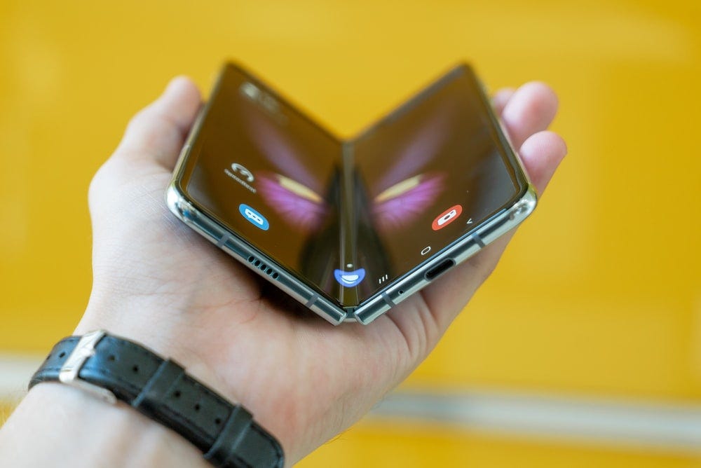
As folding display technology advances these discrepancies between experiences on a single device are only going to get larger.
As computing power continues to get smaller, cheaper and more energy efficient, you will start finding web browsers on a wider variety of hardware such as fridges, TVs and other smart home devices. In these cases the display may be large and at a distance, rather than small and close by.
Wearable technology is another space where browsers are increasingly found. Smart watches are getting more capabilities each year and with precious little screen real-estate can run a full web browser. Another kind of wearable display that may soon be a common sight are AR headsets with web browsers.
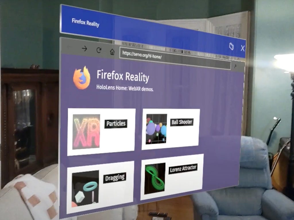
AR Web Browsers are similar to TV and Refrigerator browsers in that they are normally large (virtual) displays used at a distance. They are probably controlled by some kind of laser-pointer-like gesture controller, either through controller hardware or hand tracking.
Hand tracking in immersive headsets, whilst pretty good, can be tricky and awkward to use. It can feel like trying to poke a web page one handed using a pool cue. Using an accurately tracked controller is slightly easier but still feels like trying to use a long stick to interact with the page. So interactive elements (like buttons) need to be large with lots of padding.
Additionally, large amounts of text can be unpleasant to read in AR. So focusing more on clear graphic design and using images effectively will go a long way to making a page easier to use.
It is also important to keep in mind that many AR displays cannot go darker than the surrounding environment, so dark mode pages probably won’t work as well as dark text on light backgrounds. High-contrast can be very useful.
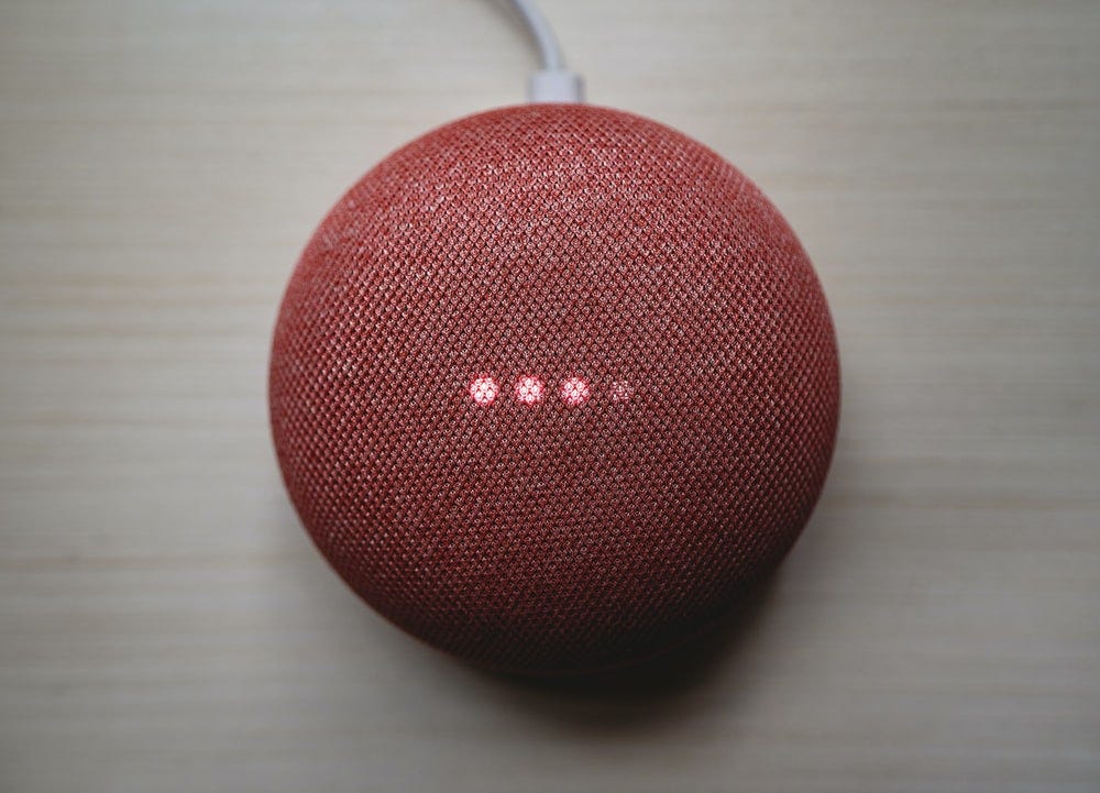
Finally, what about devices with no displays at all?
Voice assistants have become a common place device in many people’s homes. As they become more and more popular and continue to get smarter they will access more and more web content for up-to-date information. This information is usually extracted from the content of web pages using the same technology as search engines. This technology can parse correctly marked up web pages to extract pertinent information. Some search engines can access pages which are built entirely with JavaScript, but for the best SEO, widest support and fastest content updates, delivering websites with well formatted HTML with the correct metadata will enable search engines to expose much more of your content to a wide audience of voice assistant users.
The final word
So what does all this mean for building web sites?
All of the tweaks you need to make to support newer devices are the same tweaks you need to make to build accessible web pages.
-
Using well-formatted HTML with good metadata will greatly benefit screen reader users as well as improving SEO and enabling voice assistants.
-
By supporting high contrast, light mode and dark mode settings you can make your content more accessible to users and support new augmented reality devices.
-
Buttons and links with large interactive targets and plenty of space will be easier to use for people with motor difficulties whilst also letting you support devices with laser-pointer-style interactions like VR and AR headsets.
-
Avoiding too many overlays and having clear graphic design and menus with large font size, high contrast text will make the page easier to navigate for people with reduced vision or people browsing the web page from several meters away.
-
Testing your web page on very narrow displays will ensure the page continues to work for people who use web pages with a high zoom setting whilst also letting you still support newer devices with miniature screens.
Not all of the new technologies I have mentioned in this blog post will revolutionize the world like mobile phones did, but some will. By making the web clear, easy to use and accessible by default means that whatever you build will continue to work long into the future — no matter what shape the web takes.