A Rube Goldberg Machine
An introduction to post-modern Web Development
by Ada Rose Edwards - 11th September 2017
 Whitespace <3
This blog post was inspired by the wonderful talks from CSS-Day Amsterdam 2017. Especially those of Rachel Nabors, Rachel Andrew and Jen Simmons. Many of these talks introduced newer browser APIs to give framework levels of functionality built into the browser.
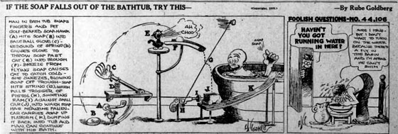
The title of this article refers to a Rube Goldberg machine, a machine which uses many interlocking moving parts to perform a function, these new APIs although very different can all work together to produce a wonderful web experience.
These new APIs are designed to be used as-is rather than requiring a CSS or JavaScript library to assist them. Their high-level power allows them to be thought of as frameworks built into the web platform for assisting with problems often found in front end web development.
This offers great benefits for performance. As there is no overhead on external dependencies, they also have great support considering how new they are.
These new APIs are powerful individually but also they complement each other beautifully, CSS custom properties being the common thread which goes through them all as it is a low level change to CSS.
Together they enable us to produce beautiful Websites written with symantic HTML where all the visual and animation design is in the CSS and the interactivity is added with JavaScript.
Topics covered:
CSS Grid
Grid layout feels like the most significant CSS API addition since FlexBox. Like Flexbox enabled powerful 1-dimensional layouts; Grid enables beautiful 2-dimensional layouts.
Grid isn't a Flexbox replacement. Where a layout is 1 dimensional e.g. a single row/column, such as in a component, Flexbox maybe more useful.
A good rule of thumb is Grid for page layouts and Flexbox for components. But feel free to use whichever tool feels best for your situation.
CSS Grid allows you to divide your page up into a template with columns and rows and label areas of your grid.
With CSS Grid you are not restricted to 12 fixed width columns like many popular grid libaries.
The grid of CSS Grid can have any number of rows and columns of unequal sizes. It can also automatically add rows or columns to allow it to grow horizontally or vertically as more content is added.
grid-column-end: span 2;
CSS Grid enables one to define, how the grid columns and rows behave with granularity. The contents are automatically placed into the grid to fill the available space. See Figure 1.
It also introduces new CSS units and functions enabling us define the widths and heights of columns and rows in relation to the contents or the remaining space in the grid.
Like with Flexbox it is going to take a while for the Web community to come to grips with the full power of Grids, but once we do, layout on the web will rival the beauty of print.
Four Column Grid
The title is the first element, I have set its writing mode to vertical, the browser accounts for this in working out the size of the grid columns. Each paragraph is set to span 2 columns.
The previous image has grid-column-start: 2; so it starts from the first free cell after the second boundary, without reordering. The image width is set to 100% so that it fills the column width. This paragraph gets placed immediately after the image because there are still two horizontal cells avaialble for it to fill in this row.
This paragraph is set to span the full width of the grid, this is done by setting grid-column: 1/-1;, a.k.a. this goes from the first grid boundary (1) to the last (4 or -1)
CSS Grid is great for very stylised layouts. Elements placed into the grid are kept perfectly inline with each other. You have lots of control to place elements in any column or row on the page. This property is very useful for controlled use of empty spaces. Empty areas on your page can make it much easier to read by reducing clutter and helping flow.
CSS Grid layouts are Analogous to how real print documents are laid out from the pages of tabloid magazines to avant-garde works of post-modern print.
They ensure that elements in the page line up with other elements even if they are of different sizes.
Notice how in Figure 1. the 1st column, the one with the vertical header, is the same width as the header. This is because the columns for the grid are set to min-content repeat(3, 1fr) which is equivalent to min-content 1fr 1fr 1fr, so 4 columns; the first is the smallest content wide, each column then recieves 1 fraction of the remaining space.
This has the nice property of keeping all the columns proportional so that if the header was wider it would adjust accordingly, use the slider below to adjust the font-size:
CSS Grid and Components
This seems like the ultimate use case for Grid!
- Components placed in the grid will be resized to fit the grid areas they are assigned to.
- Grids can also respond to the sizes of their contents, to fit the largest or smallest item in the row/column!
With CSS Grid you get the choice of rigid or dynamic layouts. Both are useful depending on your needs.
A designer can design a page layout using a Grid and when the components are added they will be resized to fit into the grid appropriately. Allowing nice seperation of concerns of page to component.
The grid can be built to have some regions which will shrink or expand to fit their contents. SO it is possible to have dynamic areas which expand or contract as required.
CSS Grid and Responsive Web Design
CSS Grid works really well with RWD. A simple grid can have different numbers of columns and rows depending on media queries. It's children will then be moved to fit into the grid however they can. If the grid is set to grid-auto-flow: dense; then items will be moved out of order to fit them in as densely as possible. This is good for when order is not important such as a photo gallery but may cause accessibility issues because it has been visually reordered but still the same order in the DOM.
We can gain more control when we use named grid areas and named grid edges. We can have content which always fills the same grid-area or goes between the same two named edges but change what that means depending on the context.
Our grid could have 7 columns on large screens, 5 on medium sized screens and only 2 on mobile. Then we can rely on a combination of auto placement and named areas to layout our content precisely on all screen sizes.
Labeling Areas
Labels are really useful for making grids easy to place items into.
You can name areas in the grid using grid-template-areas and you can name columns/rows in the grid. In your grid-template-columns and grid-template-rows
In the code sample below I have defined a two column grid using grid-template-columns, where the first edge and the last edge have been named using square brackets.
The 3 grid-column statements for the child are all equivalent. Making it go from one edge to the other.
Notice how we can use the area 'wide' which which was automatically generated because we have edges named 'wide-start' and 'wide-end'.
parent {
	display: grid;
	grid-template-columns: [wide-start] 1fr 1fr [wide-end];
}

child {
	grid-column: 1/3;

	grid-column: 1/span 2;

	grid-column: wide-start/span 2;

	grid-column: wide-start/wide-end;

	grid-column: wide;
}
CSS Custom Properties
:root {
	--my-var: red;
}

p {
	color: var(--my-var);
}
On the surface CSS Custom Properties just seem akin to static Sass variables but they are so much more than that!
Custom properties make your CSS behave like a spreadsheet. You alter a value, everything is recomputed.
CSS Custom Properties can have their value determined by other Custom Properties or combinations thereof using calc().
CSS Custom properties can be overriden at any point to change the value further down in the cascade. This allows components to use/ignore/modify the inherited custom properties as required.
They can be overriden by pseudo selectors such as :hover, or queries such as @supports or @media. Allowing more concise CSS with less duplication as by changing one or two variables you can affect many properties.
A really nice effect of having the variables calculated live in the browser rather than pre-compiled is that you can mix device-specific units such as 1rem 2em 3vw 4ex 5cm in your calculations in the stylesheet, e.g. calc(10px + 1em + 3cm)
:root {
	--a: 1em;
	--b: 10px;
	--sum-a-b: calc(var(--a) + var(--b));
}

div {
	height: var(--sum-a-b);
}
Integrating with JavaScript
CSS custom properties can be read and written using JavaScript!! This closer integration with JavaScript allows a further separtion of concerns by allowing us to keep our styling elements in our CSS file and read or control them using JavaScript.
<style>
	:root {
		--my-prop: 3em;
	}

	#my-title {
		--my-prop: 2em;
	}
</style>

<script>
	getComputedStyle(document.documentElement).getPropertyValue('--my-prop')
	// "3em"

	getComputedStyle(document.getElementById('my-title')).getPropertyValue('--my-prop')
	// "2em"

	document.documentElement.style.setProperty('--my-prop', '4em')
</script>
If you update a CSS custom property, like with any CSS property, the whole document will update and all other custom properties will be updated.
Try running the following code snippet in your browser's console on this page:
document.documentElement.style.setProperty('--blue', 'magenta')
This element, document.documentElement, corresponds to the ':root' element in CSS.
You can also run this command at any point in the tree. Try using your browser's inspector to set the style of one of the headings el.setAttribute('style', "--blue: firebrick;") the heading should change but leave the others untouched.
Web Animation API
Unlike CSS custom properties and CSS Grid which cannot be polyfilled performantly, there is a polyfill for the JavaScript Web Animation API. It can be downloaded from Web Animations on Github so there is no excuse not to use it today.
Animations are far more complex than I can go into in a short summary article so I strongly recommend watching Rachel Nabors amazing talk on Web Animations from the recent CSS Day.
Until recently on the Web, the two ways of doing animations were using CSS transitions and animations, or one of the many great libraries for doing animation on the Web already such as tween.js, anime.js and Greensock.
CSS animations and transitions are good for one-off animations triggered by a class change. It makes sense to have the styles written declaratively but in CSS it is limited with how much they integrate with JavaSript.
The API for Web Animations to me feels like a JavaScript version of the CSS Animations spec.
They have a really nice property which is currently hard to achieve on the web: Web Animations are all kept in time using the document's timeline. This ensures that a 200ms animation will always take 200ms regardless of framerate or skipped frames due to lagging.
ballEl.animate(animKeyframes, animOptions);
We have defined animation keyframes in Figure 6. the offset property in the second keyframe tells us this keyframe is at 0.7 through the animation.
It is also possible to set easing on a per-key-frame basis too. The docs on mdn go into good detail.
The point I want to make here is that it integrates amazingly with custom CSS properties!
You can use custom properties in your keyframe declaration, see Figure 7.!!!
In this example, I animate the background-color through the custom property --blue to a yellow color to the custom property --magenta.
ballEl.animate({
	backgroundColor: [
		'var(--blue)',
		'#ffff33',
		'var(--magenta)'
	]
}, animOptions);
Because the syntax for easings is the same as that for CSS, I like to keep all my easing functions in a CSS file such as easings.css then read them in when defining the animation.
In Figure 8. below, I use the approximation of 'ease in out quart' from my CSS file of easings. Which I can also use in the CSS for transitions or animations.
CSS custom properties are really great for reducing duplicate declarations of styles in your JS, they can all be kept in your CSS file.
el.animate(myKeyframes, {
	duration: 500,
	easing: getComputedStyle(document.documentElement).getPropertyValue('--easeInOutQuart'),
	fill: 'forwards'
});
CSS variables can also help with accessibility.
To continue to take it a step further, you can keep a duration multiplier, --durationK, in your CSS.
In JavaScript and CSS animations and transitions, multiply your durations by this value.
By default set the value of --durationK 1 so it has no effect on the durations.
When it is set to 0, any animation which has it's duration multiplied by --durationK will happen instantly.
This will help people who prefer reduced motion.
:root {
	--durationK: 1;
}

@media screen and (prefers-reduced-motion: reduce) {
	:root {
		--durationK: 0;
	}
}
Chaining Animations
The advantage of the Web Animations API over CSS animations is that it gives callbacks for when it is finished.
You can use anim.addEventListener('finish') to detect when it has finished. It also has a .finished property, which is a promise which resolves when it is complete. The promise interface is really nice but hasn't been implemented everywhere yet. Here is a short polyfill for it, so you can use it today.
In the example in Figure 10. once the animation has finished, it decreases the --bounceHeight css variable and plays the animation again.
Animating custom properties?
Today it is not possible to animate CSS custom properties using Web Animations. The problem lies in that the browser does not know the property type of CSS variables so does not know how to tween them correctly. For example it cannot work out that --my-var: red is supposed to be a color and not a length.
A solution is in the works, as part of the upcoming Houdini APIs. By registering a custom property, you can declare its type to allow it to be tweened. This is not available in regular browsers yet though.
Thanks to Tab Atkins for the tip!
Thanks for reading!!
I hope this has illustrated some of the new powers of the web which enable us to start letting go of our frameworks.
By using these powerful tools being built into the platform, it will make our lives as developers easier and our products faster.
It's okay that some of these tools are unavailable for some browsers today, using CSS's @supports selector or CSS.supports('display' , 'grid') in JavaScript it is possible to feature detect these new APIs and if they are unavailable we can degrade to sensible fallbacks.
Eventually the fallbacks and polyfills will no longer be required and they can be deleted.