Animating DOM Changes
Animating DOM Changes
Animating DOM Changes
Smoothly adding, removing, resizing and reordering elements
A common misconception in Web Development is that the DOM is slow. The DOM, short for Document Object Model, is the structure of the Web Site which your code interacts with. If you were to ask me whether the DOM is slow I would answer that, like most things in computer science, it depends on the circumstances.
What makes changing the DOM slow is once you have changed an element the browser has to measure the new size of each element, then has to redraw all of the elements that changed. This is always moderately expensive but modern browsers are smart about caching these calculations, invalidating as little of that cache as possible once a change is made and only doing the calculations at the last possible moment. So if you make a change to the page the browser won’t measure the new sizes until you request for it to measure them or it has to redraw the page for the next frame. If nothing has changed then it does not need to remeasure, it can use the cached values.
In real terms what this means is that when you have to change lots of the DOM’s layout in one go, you can cheaply measure the size of elements if you measure them all together, and you can cheaply make changes if you do all your DOM changes together. Interleaving reads and writes is when the expense can get out of hand.
Therefore when doing large many element animations where performance is important it’s important to take all your measurements in one go before you start making changes. That is the secret sauce behind efficiently animating changes made to the DOM.
NB: Please remember it’s important to respect user preferences for reduced motions, for some users lots of animation can make a site unusable and make them ill. So always be prepared to turn it off like using the example below.
const prefersReducedMotion = window.matchMedia('(prefers-reduced-motion: reduce)').matches;

if (prefersReducedMotion !== true) {
  // do animation
}
The rest of this article is about building the animation for when the DOM changes. We will do it using the following method:
-
Measure the position of all the things that will move. (reads)
-
Perform all of your DOM changes (writes)
-
Measure the new position of everything (reads)
-
Use inexpensive composite effects, such as transform , opacity or clip-path to place elements back at their previous size position.
-
Create an animation which smoothly animates from the starting point back to the endpoint. The end point in this case is what is already in the DOM.
In this the DOM needs to be recalculated at most twice, once before we take the first measurements and once after we have made our changes and we need to measure how things have changed.
Before we cover this in depth, here is a page where I test this technique in different scenarios: Layout Tween Below are a selection of different layouts: List, Floats, Flexbox, Grid. With controls for adding elements, try…samsunginter.net
 A gif of the demo.
We use the same technique for adding elements and changing between different layout modes in each of the demos in the example page.
Measure all the things
First, we need to know the original position of the elements that will change. We are going to add an element into parent so we will measure the position of all it’s children.
// Turn an array of elements into a map of elements to their
// respective bounding box

const boundingBoxMap = new Map(
 Array.from(parent.children).map(
   el => [ el, el.getBoundingClientRect() ]
 )
);

// boundingBoxMap.get(parent.firstElementChild);
// DOMRect { x: 8, y: 21.4, width: 606, height: 38, top: 21.4, right: 614, bottom: 59.4, left: 8 }
Now we can make any changes we like, we can add, remove and reorder elements. Change classes and styles.
We then measure everything again using the same method as above.We now know the start and end points of the animation.
The trick is to then make a new animation that starts at the old point, and animates to the new point. We can do this using some math.
To get how the position has changed we will subtract the start position from the end position. This is the transform makes the element **appear **to be back where it came from:
*const* translateTransform = `translate(${oldPos.x - newPos.x}px, ${oldPos.y - newPos.y}px)`;
Animating size is a little trickier, we could scale the element or we could clip the element, both are fast to do. Scaling it will look good on images, as they often stretch to fill. For text the individual lines don’t get larger or smaller so clipping will look better on text as it will maintain the text size.
When scaling size the math is a lot easier to do if you do all of the transformations from the top left corner.
Either Scale
(Make sure the transform origin is set to 0,0)
*const* scaleTransform = `scale(${oldPos.width/newPos.width},${oldPos.height/newPos.height})`;
or Clip-Path:
*const* heightDiff = (newPos.height - oldPos.height);
*const* widthDiff = (newPos.width - oldPos.width);

const clipPath = `inset(0px ${widthDiff}px ${heightDiff}px 0px)`;
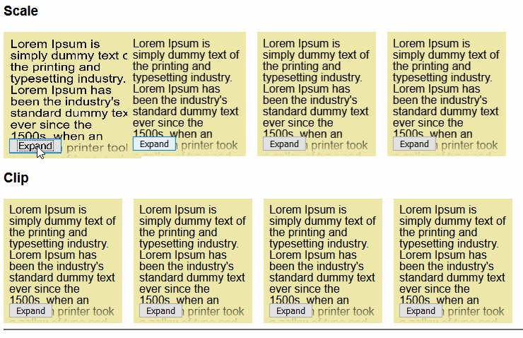 Examples of the animation change between scaling and clipping. Scale on top, clipping below.
We can then animate these using the Web Animation API. Don’t animate both scale and clip path just pick one to use.
This animation will animate it from the starting size & position we worked out to the final position and size. The final position and size is just a no-op since it needs to end up where it came from.
el.animate({
  transformOrigin: ['0 0','0 0'],

  transform: [
    `${translateTransform} ${scaleTransform}`,
    'scale(1)'
  ],

  clipPath: [clipPath, 'inset(0px 0px 0px 0px)']
}, {
  easing: 'ease-out',
  duration: 500
});
Handling new Elements
Any elements which are new won’t have a starting position, so you should find a way to animate them in nicely. For my demos I waited until the position/scale animation finished then I faded them in:
el.animate({
  opacity: ['0', '1']
}, {
  easing: 'ease-out',
  duration: 500,
  delay: 500,
  fill: 'backwards'
});
Tips
-
If the parent element is likely to change size do the same thing for its parent as well so all it’s siblings get animated accordingly.
-
If you are animating all of an element’s children don’t animate that element as well. It looks weird.
-
Clipping works best for text, scaling for images.
-
Save your animations for user interactions, as that is when the user is likely to expect it.
-
Don’t over-use animations they should be little moments of joy otherwise they will get tedious.
Using our library yourself
Since it’s a pretty general case we have made the library in the demo available on npm. It’s pretty bare-bones so if you need more features then please feel free to take inspiration from it to write your own or to fork it as you need. layout-tween This is a library to assist in animating changes to the DOM, to use it Call the function on some elements whose…www.npmjs.com
By Ada Rose Cannon on April 23, 2020.
